

Why Designers Are Recommending Light Blue Paint Over Neutral Shades
When homeowners think about paint colors that will remain stylish for years to come, neutrals like white and beige typically come to mind. But interior designers are now challenging that assumption, arguing that light blue deserves equal standing as a timeless, versatile choice. This shift in perspective matters for anyone planning a paint project, because it opens up a wider range of sophisticated options beyond the standard neutral palette.
According to design professionals, light blue functions as both a distinct color and a neutral backdrop. The reasoning is straightforward: light blue mirrors the natural tones found in the sky, water, and natural environments. This connection to nature gives it the same enduring quality as greens or earth tones, while offering far greater visual interest than traditional neutrals. For shoppers evaluating paint selections, this means light blue can work in virtually any room without feeling dated or requiring frequent repainting.
The Historical Case for Light Blue in Interior Design
Blue has maintained prominence in design for centuries, appearing in Chinese export porcelain, antique textiles, painted furniture, and traditional wallpapers. This historical pedigree suggests that light blue transcends fleeting trends. Rather than following current color fads, homeowners who select light blue are tapping into a proven aesthetic lineage.
The versatility of light blue extends to how it interacts with other colors and materials. Professional designers report that light blue pairs seamlessly with greens, warm camel tones, reds, oranges, and natural textures. It complements brass hardware, antique furnishings, and blue-and-white porcelain equally well. When you’re selecting a paint color to coordinate with existing furniture, light blue’s adaptability provides confidence that your choice will work across different design scenarios.
Specific Light Blue Paint Colors Recommended by Professionals
For shoppers ready to commit to light blue, knowing which specific shades deliver results matters. Several paint products have earned endorsements from experienced designers:
- Benjamin Moore Blue Lace (1625) offers a soothing, softer tone that works beautifully in bedrooms and intimate spaces when paired with simple blue-and-white accents or more vibrant textiles depending on your preferred aesthetic.
- Farrow and Ball Light Blue (No. 22) is another designer favorite that balances softness with subtle depth, making it suitable for various room types.
- Sherwin-Williams Resolute Blue (SW 6507) represents a brighter option in the light blue range, bringing cheerfulness and personality without appearing juvenile or overly trendy. This shade pairs beautifully with natural textures, warm brass fixtures, antiques, and traditional blue-and-white porcelain.
The range of options within the light blue category means shoppers can choose based on room lighting, existing furnishings, and personal preference. Testing samples on your walls under different lighting conditions remains important, as undertones and brightness levels shift throughout the day.
Application Strategies for Maximum Impact
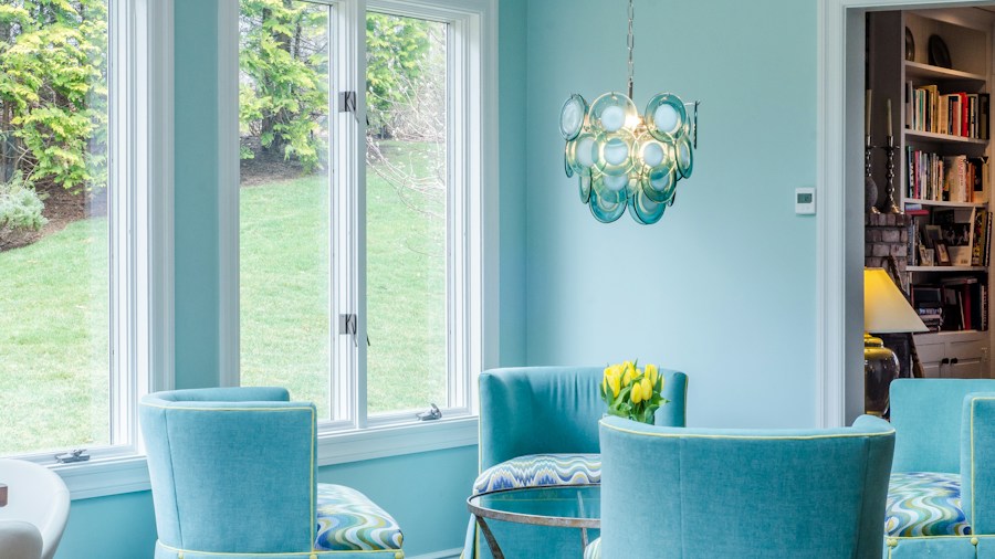
Light blue works effectively in multiple application scenarios. You can color drench an entire room for maximum visual impact, creating an immersive, calming environment. Alternatively, you might apply light blue selectively to cabinetry, trim work, ceilings, or accent walls. This flexibility means you’re not locked into a single design approach.
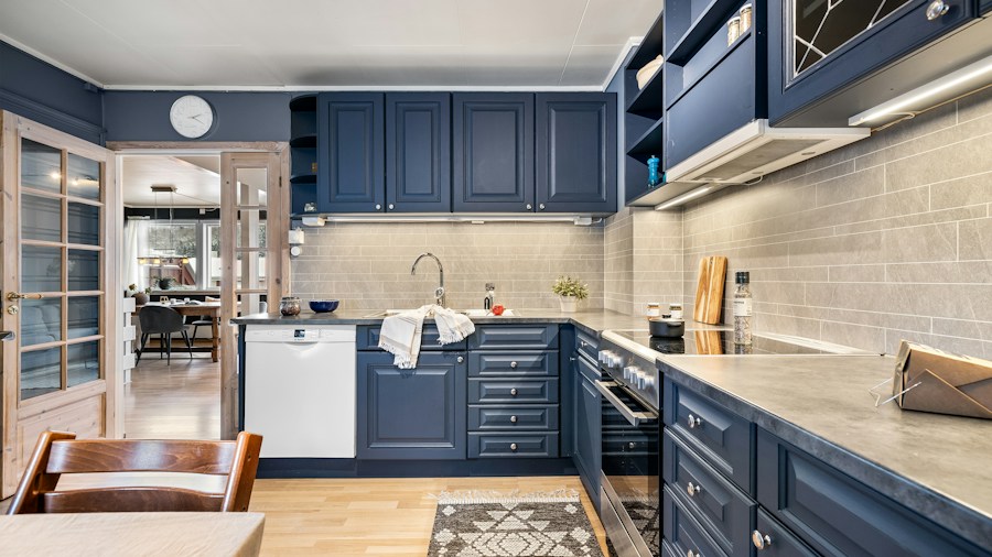
When applied to features like built-in cabinetry and trim, light blue adds personality and visual interest while maintaining a timeless sensibility. This approach proves particularly effective in nooks, kitchens, and bathrooms where you want defined character without overwhelming the space. Unlike beige or standard white, light blue makes a statement while remaining sophisticated and enduring.
What This Means for Your Next Paint Project
The growing recognition of light blue as a timeless paint option provides shoppers with a legitimate alternative to neutral monotony. If you’re tired of all-white walls but uncertain about committing to bolder colors, light blue offers the best of both worlds. It’s saturated and lively enough to feel intentional and distinctive, yet subtle enough to coordinate with diverse interior styles.
Before painting, research how different light blue shades perform in your specific room. Lighting conditions, wall exposure, and surrounding colors all influence how a shade appears. Many manufacturers offer sample sizes, allowing you to test options before purchasing full gallons. Understanding current design trends can also inform whether specific undertones align with your home’s overall aesthetic direction.
Light blue represents a low-risk, high-reward paint selection for homeowners seeking timelessness with visual depth. By selecting one of the professionally endorsed shades or finding a comparable option from your preferred paint manufacturer, you can refresh your space with confidence that your choice will remain appealing for years ahead.









Write Your Review
No reviews yet. Be the first to share your experience!