

If you’re planning to repaint your home’s exterior this year, timing matters more than you might think. Design trends shift rapidly, and choosing a color that’s already falling out of favor can leave your home looking dated within months. Before you commit to this expensive project, it’s worth understanding which shades designers are moving away from in 2026 so you can make a decision you won’t regret.
Why Outdated Exterior Colors Matter for Your Home
Your home’s exterior color impacts more than just aesthetics. A poorly chosen paint shade can affect your property’s curb appeal, resale value, and how welcoming it feels to visitors. Design professionals consistently caution homeowners against trending colors that peak quickly and fade even faster. The good news: understanding what’s out helps you choose what’s in and avoid costly mistakes.
Dark, Muted Browns Are Losing Their Appeal
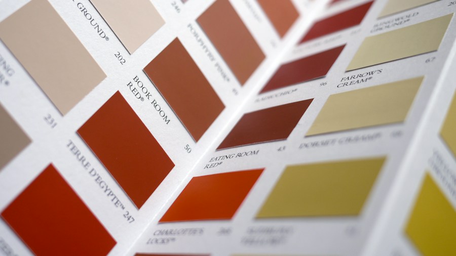
Once considered a safe, earthy option, dark and muddy brown tones are now widely viewed as outdated. These shades can make homes appear drab and lifeless, especially on properties with limited natural light. Additionally, dark browns absorb heat, making them impractical in warm climates. Rather than abandoning brown entirely, designers recommend lighter, warmer variations like tan or warm caramel tones that maintain earthiness without the dull appearance.
Bright Yellow Is Out of Fashion
That sunny yellow you admired might not photograph as well as you hope. Design experts increasingly warn against bright, saturated yellows for exterior applications, noting they often appear tacky and overly retro. Real estate professionals even advise sellers against yellow exteriors, as many buyers perceive them as dated. If you want yellow undertones without the intensity, consider creamy, butter-toned whites instead.
Mint Green Feels Like a Time Capsule
Mint green had a major resurgence in the 2010s, and that association is exactly the problem now. This cool, pale shade reads as frozen in time rather than fresh and contemporary. While vintage architecture can pull off retro colors successfully, mint green is considered one of the least sophisticated retro options. Warmer greens like soft pistachio or muted olive are far more timeless.
Baby Blue and Pale Pastels Are Fading Out
Pastel blue hues evoke the 1980s, and that nostalgic quality is precisely why designers are moving away from them. These washed-out shades can make a home’s exterior feel cheap and uninviting. If you love blue, opt for deeper, more muted French blues instead, which carry antique sophistication without looking dated.
Yellow Beige Screams Builder Grade
Yellow-toned beige was ubiquitous in 1990s Tuscan-inspired developments, and its overuse has made it feel generic and uninspired. This particular warm beige is now associated with mass-produced builder homes rather than thoughtfully designed residences. Cooler beiges, true greiges, or sophisticated taupes offer neutral warmth without the dated construction feel.
Barbie Pink Is Trending Downward
The bright pink exterior trend that captured attention around 2024 is already showing signs of age. Designer analysts note that Barbie-inspired hot pinks feel dated after just 18 months of popularity. The real problem: any landscaping looks cartoonish rather than sophisticated. If pink appeals to you, earthy clay pinks offer warmth and personality without the playful, temporary quality.
Pure Black Is Saturating the Market
The modern farmhouse movement made glossy black doors and high-contrast black-and-white exteriors everywhere, but this look is now firmly associated with a specific (and passing) design era. Pure black can feel harsh and severe, particularly on homes without the right architectural style. Charcoal offers similar drama with greater sophistication, while navy provides depth for older or traditional homes.
Fire-Engine Red and Bold Primary Colors
Super-saturated reds, especially those with blue undertones, peaked in the late 1990s and early 2000s during the Tuscan design craze. Bright primary colors that work as interior accents become overwhelming on entire facades. Warmer alternatives like terra cotta provide color and drama while feeling grounded and contemporary, avoiding the jarring intensity of fire-engine red.
Stark White Without Warmth Looks Soulless
Pure white has shifted from looking modern to looking sterile. A colorless white can actually cheapen a home’s appearance rather than elevate it. Whites with subtle warmth, undertones of cream, or hints of green feel more refined and livable, creating a home that feels intentional rather than generic.
Sage Green Is Now Overdone
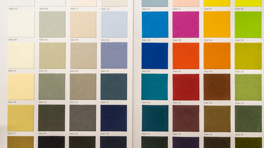
Once fresh and modern, light sage green became the default choice for farmhouse and transitional designs throughout the early 2010s. Its widespread adoption has drained the color of its distinctive appeal. Deeper olive tones with bronze undertones replace it, offering nature-inspired calm without the tired, expected feeling that light sage now carries.
Making Your Color Choice Count
The pattern across all these shifting preferences is clear: designers favor sophisticated, nuanced colors over flat, saturated, or washed-out tones. Your exterior color choice should feel intentional and timeless rather than tied to a specific trend or era. Before painting, consult color swatches in natural light, review recent home sales in your neighborhood, and consider whether your chosen shade will still feel relevant in five years. This investment deserves careful thought and professional guidance to avoid costly regrets.





Write Your Review
No reviews yet. Be the first to share your experience!