

When it comes to creating a home that will stand the test of time, trending colors and fleeting design fads often lead to regret. Instead, interior design experts agree that anchoring your space in classic paint palettes tied to enduring styles is the smarter path for homeowners seeking lasting appeal.
Design professionals recently identified five iconic paint color combinations that have defined America’s most beloved interior design movements. Understanding these color pairings gives shoppers a reliable foundation for making paint choices that will feel fresh and intentional for years to come, rather than dated within a season or two.
Country Cottage: Sage Green and Dusty Pink
The cottage aesthetic draws heavily on warm, muted earth tones that evoke a sense of timeless coziness. Sage green and dusty pink have emerged as the quintessential cottage palette, working together to create that coveted vintage warmth without feeling overly precious or trendy.
According to design studios specializing in this look, these soft, earthy shades pair beautifully with natural wood tones and period-appropriate trim work. The combination creates visual interest while maintaining an elegant restraint. Brands like Sherwin-Williams and others offer several interpretations of these classics, allowing homeowners to choose the exact undertone that suits their space. When paired with walnut cabinetry or aged architectural details, this color scheme delivers authentic charm that resonates across generations.
New England Coastal: Crisp White and Sea Blue
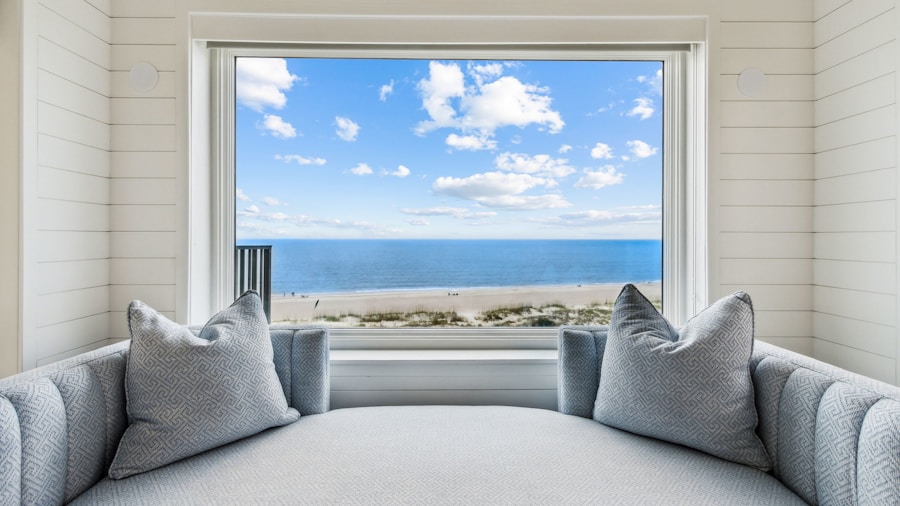
Coastal design draws inspiration from traditional beach architecture and maritime heritage, creating a palette built on white and muted blue. This pairing reflects the American coastal tradition and remains deeply connected to New England’s architectural identity.
The beauty of this combination lies in its versatility and restraint. Soft, heritage-inspired blues paired with warm cream tones provide enough contrast to showcase traditional architectural details without veering into overly formal territory. This approach works equally well on shiplap walls, painted window frames, or as a full feature wall treatment. Paint manufacturers offer several historically accurate interpretations of this palette, making it simple for homeowners to locate the right shade for their specific lighting conditions and architectural style.
Midcentury Modern: Muted Mustard and Olive Green
The resurgence of midcentury modern design has renewed interest in the warm, saturated tones that defined the era. Mustard yellow and olive green capture the nature-inspired aesthetic central to midcentury interiors while delivering visual warmth and personality.
Today’s versions of these colors often lean slightly softer than their 1950s counterparts, allowing them to feel both nostalgic and contemporary. This strategic muting keeps the retro appeal intact while making the palette feel current and sophisticated. When combined with period-appropriate furnishings and materials, nature-inspired design principles add depth and intentionality to the overall scheme.
Classic Heritage: Charcoal and Deep Gray
Heritage and colonial-inspired interiors benefit from deeper, more dramatic color choices. Charcoal, navy blue, and warm gray tones have long been associated with classic American architecture and continue to deliver timeless character.
These moody, sophisticated hues enhance architectural details and create a sense of permanence that transcends design trends. Whether applied to interior walls or exterior facades, these colors communicate a quiet confidence and enduring style. When paired with warm wood tones and softer accent colors, contemporary interior design innovations can layer beautifully over traditional color foundations, creating spaces that feel both grounded and current.
Farmhouse Style: Warm White
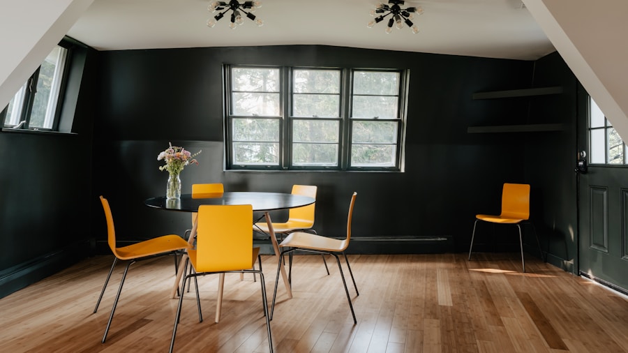
The farmhouse aesthetic celebrates warmth, rusticity, and lived-in comfort, making warm white the essential color for this style. Unlike stark bright whites, these off-white and cream tones carry subtle warmth that complements natural wood, shiplap, and raw materials central to farmhouse design.
Warm whites balance the earthiness inherent in farmhouse style while providing brightness and breathing room. This palette has remained consistent across American farmhouse traditions for centuries, proving its staying power and universal appeal. Many heritage paint manufacturers have developed specific warm-white formulations designed to coordinate with rustic wood tones and farmhouse materials.
Why Classic Colors Matter for Shoppers
Choosing paint colors tied to enduring design styles rather than momentary trends offers practical benefits beyond aesthetics. These established palettes come with proven longevity, broad paint manufacturer support, and design precedent that makes coordinating furniture and decor simpler.
For homeowners planning renovations or updates, anchoring decisions in classic color combinations reduces the risk of investing in a scheme that feels tired or dated five years later. Whether your home leans toward one particular style or blends elements across eras, building a color foundation rooted in these timeless palettes ensures cohesion and lasting appeal. Layering vintage-inspired accessories over these classic bases further strengthens the overall design direction.









Write Your Review
No reviews yet. Be the first to share your experience!