

A Once Plain Living Room Gets a Striking Makeover with Color and Pattern
When a homeowner discovered her 1918 cottage had been stripped of all original character during a previous renovation, she knew immediate action was needed. The walls were plain white, the finishes were generic, and the space felt uninspired. Instead of accepting the blank slate, she decided to take a risk with bold colors and patterned wallpaper to restore warmth and personality to the living room.
The transformation combines several design strategies that work together to create a cohesive, character-filled space. Paint, pattern, and architectural details like board and batten paneling all play important roles in the final result. For homeowners looking to upgrade builder-grade rooms, this project demonstrates how strategic use of color and texture can completely reshape how a space feels.
Board and Batten Adds Architectural Interest

The first step in the renovation involved adding board and batten wall treatment, which instantly gave the living room more visual depth and period-appropriate character. The homeowner selected a warm, goldish-tan paint color for the paneling, which grounds the room and complements the other design choices throughout the space. This architectural detail alone makes a significant difference in how the room reads, transforming it from flat and featureless to dimensionally interesting.
The board and batten treatment works especially well for renters and those in older homes, as it can be adapted to fit different living situations. Wood paneling is increasingly replacing traditional wallpaper in modern homes, offering homeowners a way to add texture and depth without permanent wall treatments. However, combining paneling with strategic wallpaper placement offers the best of both approaches.
Strategic Color Placement Throughout the Room
Rather than overwhelming the space with a single dominant color, the homeowner distributed bold hues strategically. The walls themselves feature a bright white that’s lighter than the original, creating a fresh backdrop for other design elements. The front door receives the boldest treatment with a bright red finish, creating a focal point that draws the eye without dominating the entire room. This same red color appears on select furniture pieces throughout the cottage, creating visual continuity.
Small accent pieces painted in bright red help tie the color scheme together without requiring a full room repaint. This approach works well for shoppers who want bold color but worry about overwhelming their space. By limiting intense hues to architectural features and small furniture items, the overall effect feels intentional rather than chaotic.
Wallpaper and Fabric Create Pattern Interest
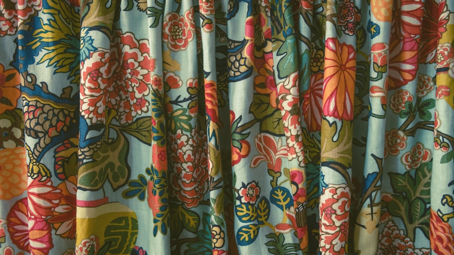
The living room’s primary pattern comes from cafe curtains made from linen featuring a vintage vegetable tree design. The homeowner and her mother created these curtains themselves as a DIY project, using the same patterned fabric for throw pillows on the sofa. This coordinated approach to pattern prevents the space from feeling too busy while still introducing visual interest through texture and design.
For budget conscious shoppers, peel and stick wallpaper options now offer affordable ways to add pattern to living spaces. These temporary wallpaper solutions allow renters and homeowners to experiment with bold designs without commitment. Whether using traditional wallpaper, fabric accents, or peel and stick alternatives, pattern creates the finishing touch that transforms a plain room into one with personality and charm.
What This Means for Shoppers
This renovation teaches several lessons for anyone working with builder-grade spaces. First, color doesn’t have to be all or nothing: strategic placement of bold hues creates impact without overwhelming. Second, combining multiple design approaches, from architectural paneling to patterned fabrics, creates a more interesting and layered aesthetic than relying on a single technique.
Third, DIY projects like sewing cafe curtains or painting furniture pieces allow homeowners to save money while personalizing their spaces. The homeowner used unfinished raw wood furniture throughout the cottage, painting select pieces to match the color scheme. This affordable approach means that creating a designer-quality living room doesn’t require an unlimited budget.
Finally, this project shows that taking design risks can pay off. By choosing mustard and red tones instead of safe neutrals, and by mixing vintage patterns with bold architectural details, the homeowner created a space that feels authentically hers. For shoppers hesitant about bold color and pattern, this before and after serves as inspiration that calculated risks in home design can result in beautiful, livable spaces that feel far from builder-grade.









Write Your Review
No reviews yet. Be the first to share your experience!